This post is a part of a series on drug shortages.
I spent the bulk of the morning setting up my development environment and refreshing myself on R and my analysis code from our paper. I then grabbed a recent export of the drug shortages database and plugged it in to my old code, and with some patching up here and there, I was able to pump out updates to some of the charts used in our paper (and a few new ones). You can find all of my mutant code from today over here.
New shortages per month
First up, here’s a tally of new drug shortages per month from the drugshortagescanada.ca (DSC).

You can clearly see that the database came online in March, 2017. If there are any differences over the last few years in the number of shortages, I’m not seeing anything obvious from that plot. We may have to do some statistics….
Also, in seeing this plot again, I’m reminded that what I’d also like to see is the number of shortages active at any given time, as well as some sense of distribution of shortage duration over time. Perhaps that’s tomorrow’s work.
Reasons for shortages
Next up is a plot showing the distribution of stated reasons for shortages. I don’t recall if we had a plot like this in the paper. In any case, nothing jumps out at me:

Top shortages
This next chart is a doozy, and I’ve made it even more horrendous by faceting it by year. This was our attempt at trying to show the kinds of drugs most often in shortage. As you can see…. well, I’m not sure what you can see. If you have some ideas for a more interpretable figure that captures the same essence, please comment below.

Shortages by manufacturer size
Next up, three charts for each year from 2017-2019 which attempt to give some sense of whether larger manufacturers have proportionately greater or fewer than smaller drug manufacturers.
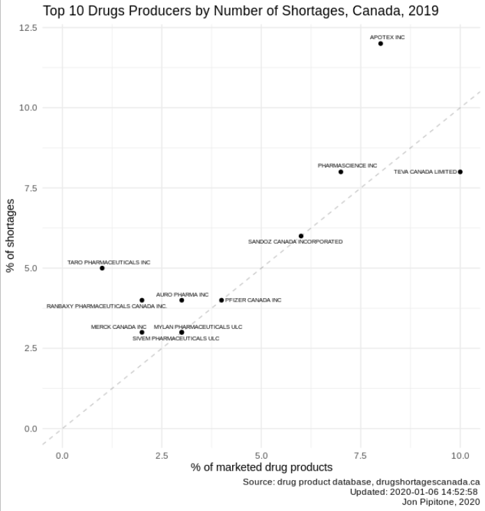


Note that the dotted line is not a trend line, but in fact shows a slope of 1, i.e. when the proportion of shortages = proportion of drugs marketed.
My takeaways are this: (1) I should have kept a consistent scale/limits on the charts because comparing them is tricky, (2) number of shortages generally vary with size of the manufacturer (i.e. points nearish to the dotted line), which I expected, and (3) there are a few subjective outliers each year (e.g. Apotex, in all three years). I have not run any statistics to look at these data in any more detail.
Drug Products
The last two charts deal with the Drug Product Database (DPD) only. I think it’s important to keep these data in mind because they provide a rough denominator when looking at raw shortage counts. Here are the number of drugs in the database over the last 40 years:

There are a few discontinuities which I don’t have great explanations for. For example, from 2017 to 2018 there is sudden drop in the number of “marketed” drugs which is mostly accounted for by a new status label being used “cancelled (unreturned annual)”. I’ll need to dive back into the DPD’s scheme to see what that might be about.
(NB: The plateau from 2020 onwards is simply because I extended the plot into the future but there are, obviously, no updates in the database providing any new information.)

In this chart, I attempt to label each DIN as either a generic or innovator by looking at when it was first marketed relative to other drugs with the same ingredient. I’d love to know if this method makes sense.
2 Comments
Comments are closed.